A Guide to Easy Digital Mapping
for Historians of Early Modern Europe
While this guide was originally designed for Yale’s community of scholars working in the field of Early Modern European history, the basic steps below are applicable for scholars from different fields and at different institutions. Its aim is to provide you with the tools needed to quickly produce maps for use in presenting research. It consists mainly of three parts: (1) an exercise designed to map location-based data using Google Maps, (2) a guide to resources available to members of the Yale community wishing to move into more powerful GIS software, and (3) a list of data sources that can be used in researching and portraying Early Modern Europe using digital mapping. While this guide aims to cover the representational uses of digital mapping software, many of the resources identified can also be used for more analytical aims.
Using Google Maps to Depict Simple Point Data
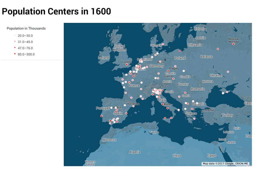
This exercise is designed to walk you through creating a basic population map of Europe in 1600 using Google Maps and a sample dataset. If you have a list of locations that you want to depict on a map, the simplest way to do so is through Google Maps. To do so, we will work in the environment Google has created for user generated maps: httpss://www.google.com/mymaps.
Create a Basemap
To create your own map, you first have to create the canvas on which your data will be displayed. Navigate to the above link and then follow the instructions below.
1.
Click
the ![]() button in the
top left hand corner.
button in the
top left hand corner.
2. The resulting screen will be a familiar Google Maps layout with a few notable additions. For this exercise, we will mostly be working in box which is found in the top left hand corner. It should look like this:
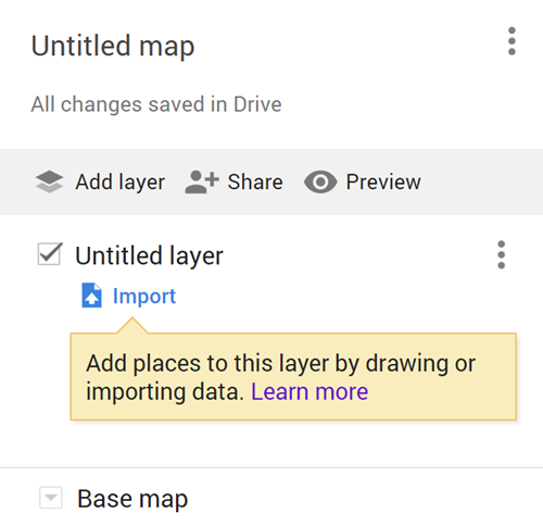
3. The first change we should make is to the map title. By clicking “Untitled map”, we can change the title to whatever we like. For this exercise, I would suggest “Population Centers in 1600”.
4. Since we are
interested in depicting historical data, we are likely not interested in modern
political boundaries. To change the basemap, click the arrow icon ![]() to
the left of “Base map”.
to
the left of “Base map”.
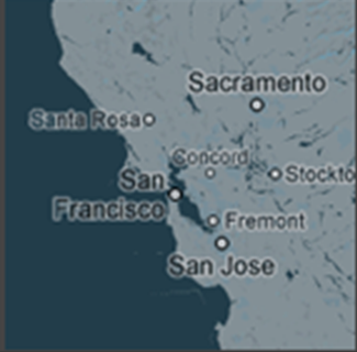
5. Of the nine options presented, only “Dark Landmass” does not include modern political boundaries. Select this image to change your basemap:
Adding Point Data
Now that we have a basemap, we can begin to add our point data. By point data, I mean information that is best displayed as points on a map, like cities on the global scale or specific buildings on the local scale. For this exercise, I have created an Excel file which represent the top 100 most populous European cities in 1600, taken from Paul Bairoch, Jean Batou, and Pierre Chèvre’s La Population des Villes Européennes, 800-1850 (1988). You can download the file here: https://bit.ly/2pqCgX9.
6. Click the ![]() button
below “Untitled layer” to upload a spreadsheet from your computer.
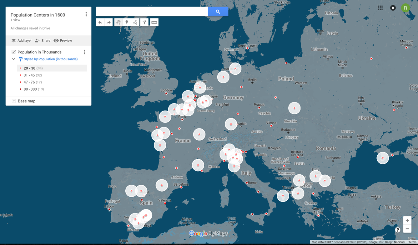
button
below “Untitled layer” to upload a spreadsheet from your computer.
7. In the dialogue
that pops up, click the ![]() button.
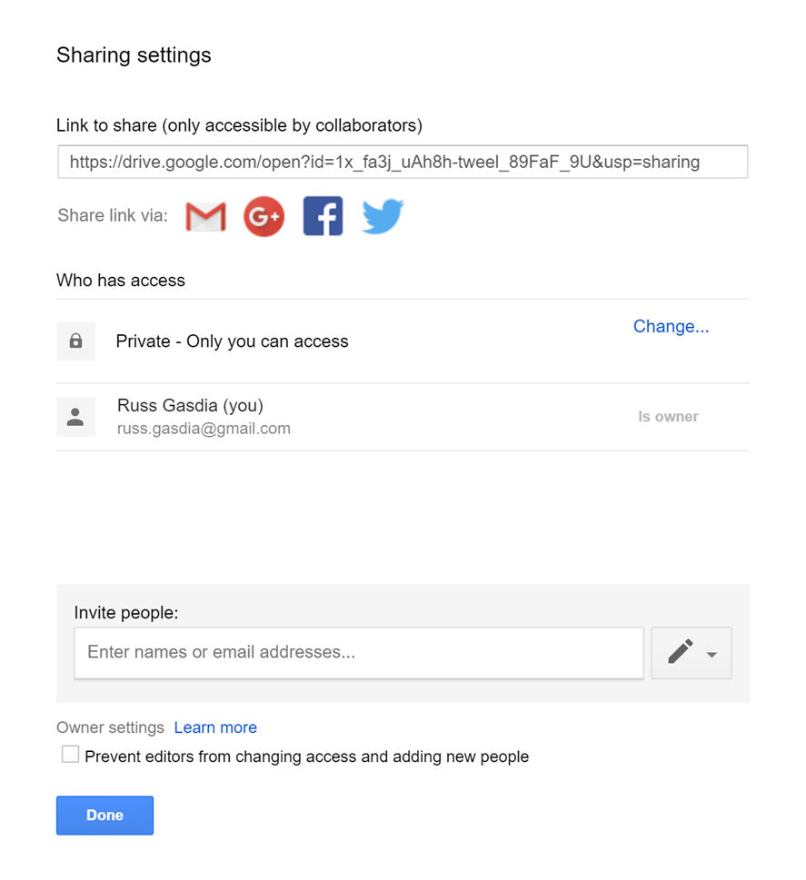
Navigate to and select the Bairoch et al. file you downloaded above.
button.
Navigate to and select the Bairoch et al. file you downloaded above.
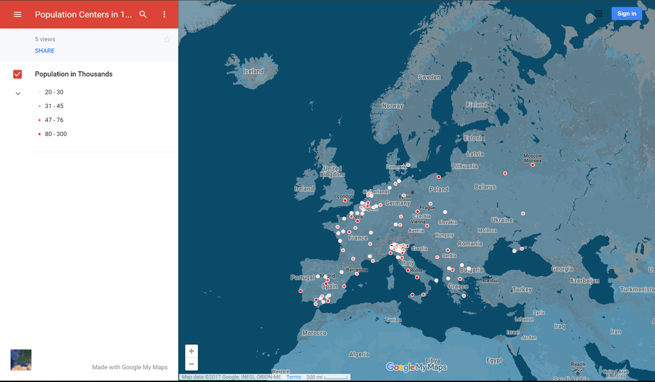
8. The next dialogue
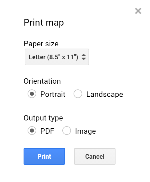
will ask you to select the columns in your spreadsheet that represent the
location of each point. For the Bairoch et al. file, the “Latitude” and
“Longitude” columns should already be selected. If they are not, click on the
box next to each column to select them, then click the ![]() button.
button.
· ASIDE: You do not need latitudes and longitudes to display point data using this method. Google can “geocode” names, which means it will provide coordinates for descriptive names that you give it. While this means passing it modern place names, or even better modern street addresses, you do not need to use the column you will ultimately use to label you points for this purpose. For example, you could have a file with an observation of “Aegidienkirche, Hanover” in the Name column and then “Breite Str. 14, 30159 Hannover, Germany” in the Location column. Even though the original Aegidienkirche was destroyed in WWII, Google Maps will still display a point labeled “Aegidienkirche, Hanover” at the correct location of the original church.
9. The next
dialogue asks you to select a column which can be used to label and uniquely
identify each point. For the Bairoch et al. file, we will use the “City Name” column.
After clicking the corresponding circle, then click the ![]() button.
button.
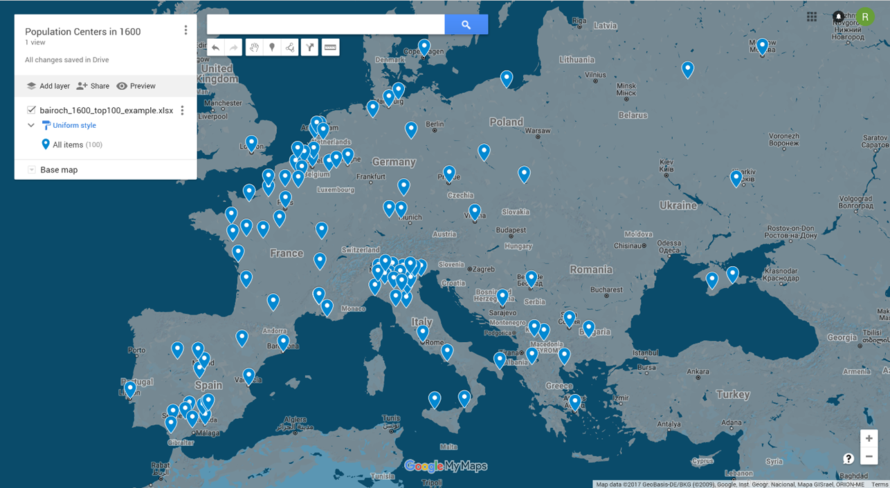
10. Google will take a while to process before displaying your data. The result should look like this:
Changing the Symbolic Representation of Your Data
The above map might be all that is required for many purposes. For this exercise however, the blue droplets do more to obscure than highlight our data, which includes information on population levels for each city. We therefore want to have smaller icons (to show individual cities in densely populated areas like northern Italy), and some way of depicting different population levels.
11. Before moving on, you should rename the layer which depicts your data. By clicking “bairoch_1600_top100_example.xlsx”, we can change the layer name to whatever we want. It is best to use a name which identifies the type of data contained in that layer, since this will be the title of the legend we are producing below. For this exercise, use “Population in Thousands”.
12. Next, we will use
a color gradient to show different population levels in each of the cities. To
do so, click the ![]() button
under “Population in Thousands”.
button
under “Population in Thousands”.
13. In the balloon
that pops up, click the ![]() menu
under “Group places by”. Within that menu, select “Population (in thousands)”
under “Style by Data Columns:”.
menu
under “Group places by”. Within that menu, select “Population (in thousands)”
under “Style by Data Columns:”.
14. In the balloon
that pops up, click the circle next to “Range”. Since our basemap for this
exercise includes mostly shades of blue, click the ![]() menu to
change the color gradient to the red option,
menu to
change the color gradient to the red option, ![]() . Exit
out of the balloon to return to your map.
. Exit
out of the balloon to return to your map.
· ASIDE: You can also change the number of divides in your range. If you use more than 4, you will have a wider range of colors, but the below steps will take more time.
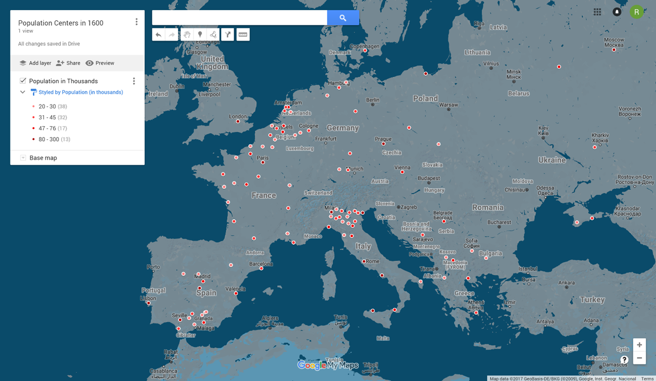
15. While this has changed our icons’ colors to reflect their different population levels, we still have the oversized droplets. If we turn to the box with our layer data, we see there are now four separate icons, with the population range they represent. By hovering over one of these icons, we see a paintbucket appear:
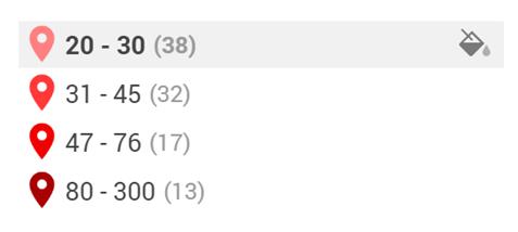
16. Clicking this
paint bucket opens a menu allowing us to change different elements of the symbology
for the given set of population ranges. Click the ![]() button
to open up a menu of the different icon options. For this exercise, select the
small dot icon:
button
to open up a menu of the different icon options. For this exercise, select the
small dot icon: ![]() . Select
the
. Select
the ![]() button
to save your selection.
button
to save your selection.
· ASIDE: Given your particular data needs, it might make sense to also change the label and color for the icon as well. You do not need to use a color continuum if the data you are trying to display is non-continuous and is best displayed in terms of categories. The icon set also includes a number of icons which might be useful for other research based needs.
17. Repeat step 16
for all of the icons in your data layer until they are all represented by the
small dot icon (![]() ). The
results should look like this:
). The
results should look like this:
Adding Points and Editing Descriptions
As you expand on your research, you might want to add new data points to your map. You might also want to change a specific figure in a point you have previously created.
18. To add a point,
click the![]() button
below the search bar. Your cursor will turn into a cross symbol. Place your
pointer over Warsaw (NE corner of the map) and click to create a new point.
The bubble that pops up will look like this:
button
below the search bar. Your cursor will turn into a cross symbol. Place your
pointer over Warsaw (NE corner of the map) and click to create a new point.
The bubble that pops up will look like this:
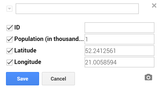
19. You will notice
that the “Latitude” and “Longitude” field are already filled in based on where
we placed the point (yours may therefore be slightly different). We can ignore
the ID field for now. The top box in the bubble is for the name of the city,
or the name you want to use to label the point. For this exercise, use
“Warsaw”. For the population field, enter “1”. Click the ![]() button
to create your new point.
button
to create your new point.
20. You will notice the new point has automatically been assimilated into the symbology scheme we have already set-up, with the lowest population range now representing 1-30 thousand people.
21. If you make a
mistake when adding points, click the ![]() button underneath
the search bar to undo your last action. Do so now to remove the Warsaw point
we just added.
button underneath
the search bar to undo your last action. Do so now to remove the Warsaw point
we just added.
22. A similar method is used to change the data for any specific point you have already displayed on the map, including those points from your initial spreadsheet. For example, if you click the point for London, the following bubble will pop up:
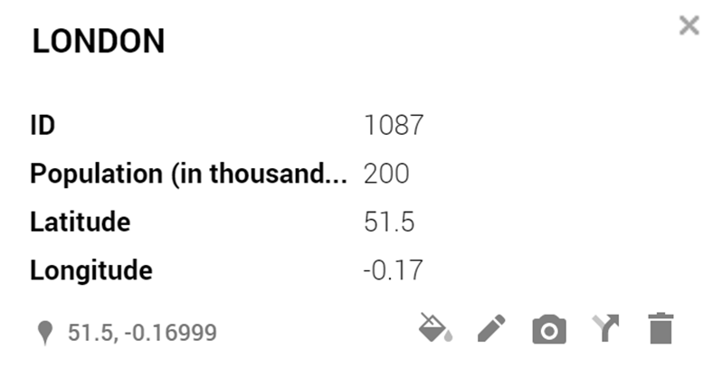
23. Click the ![]() button to
edit the data for this point. For example, you can change the Population field
to “1” and click save to automatically change the symbology for the point based
on our existing color scheme. Undo this change so we can stay true to the original
data.
button to
edit the data for this point. For example, you can change the Population field
to “1” and click save to automatically change the symbology for the point based
on our existing color scheme. Undo this change so we can stay true to the original
data.
· ASIDE:
The ![]() button
can be used to change the symbology for all points within the same range as the
given point. The
button
can be used to change the symbology for all points within the same range as the
given point. The ![]() button
(as well as the delete button on your keyboard) can be used to delete any given
point.
button
(as well as the delete button on your keyboard) can be used to delete any given
point.
24. You can also
update your data using a data table view. Click the ![]() button
next to “Population in Thousands” in our layer box and select “Open data table”.
You should see the following table:
button
next to “Population in Thousands” in our layer box and select “Open data table”.
You should see the following table:
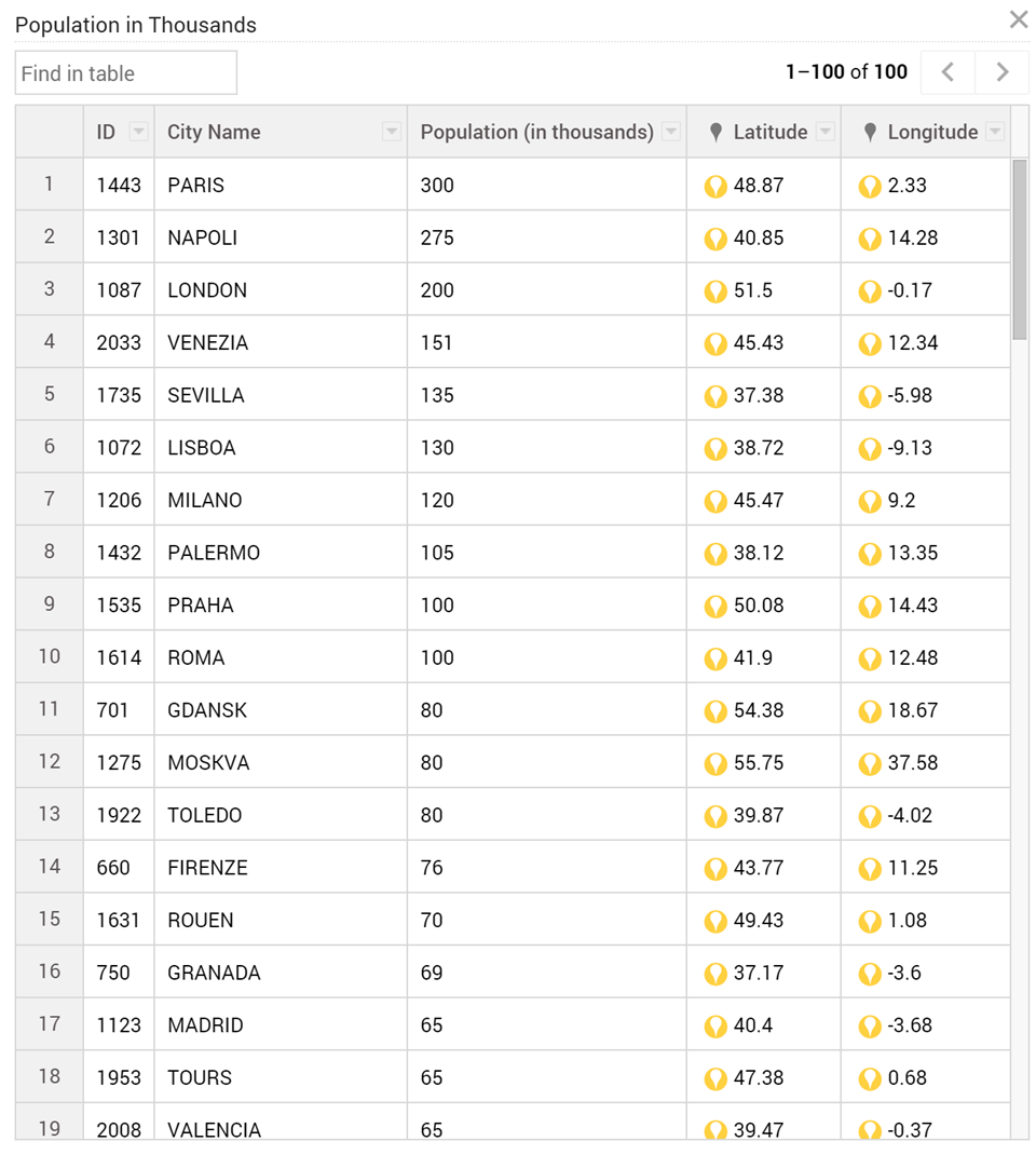
25. Clicking any of
these fields will allow you to edit any given value. Both the symbology and
the labels will be automatically updated as you make your changes. Click the ![]() button in
the top right corner of table when you are done making your changes.
button in
the top right corner of table when you are done making your changes.
Using and Exploring Your Map
As you are editing your data, adding new points, and choosing how best to display your data, you might find your self wanting to see where specific points are located on your map. There are a couple of easy ways to do this.
26. You can use the
layer box to highlight specific groups of cities matching specific criteria.
For example, by clicking our lowest range of populations ![]() we
can highlight all the cities in our dataset with populations below 30 thousand,
like so:
we
can highlight all the cities in our dataset with populations below 30 thousand,
like so:
27. Click anywhere on the map, like somewhere in the Atlantic, to clear your selection.
28. You can also use the table view described above to highlight a chosen subset of cities. Placing your cursor over any row in the table will highlight the corresponding point on the map. By holding the Ctrl button on your keyboard and clicking on successive rows, you can highlight multiple cities.
29. The final way to
highlight specific cities is by searching for them. Using the search bar at
the top of the map, we can search for the name of a specific city in our data.
Instead of hitting enter after entering your search term, however, examine the results
which drop down from the search bar. Only those results which match our symbology
refer to points in our dataset, the other results with ![]() icons are
Google search results for global locations (similar to the results you would
see in a Google Maps search). Click the correct result to bring up the
information for that given point. Note that this will also zoom into the
point. To zoom back out, use the
icons are
Google search results for global locations (similar to the results you would
see in a Google Maps search). Click the correct result to bring up the
information for that given point. Note that this will also zoom into the
point. To zoom back out, use the ![]() button
at the bottom right of the map.
button
at the bottom right of the map.
Sharing and Exporting Your Map
Once you have finished adding and displaying your data, there are two ways to share your map. One will result in an interactive map that anyone with a web browser can engage with. The other will produce an image of your map for inclusion in a paper or presentation.
30. To share an
interactive version of your map, click the ![]() button in
the layers box on the left of your map. The below box should pop up:
button in
the layers box on the left of your map. The below box should pop up:
31. Click the “Change…” link to open up your sharing permissions for this map. Choose the circle next to the below option:

32. Click the ![]() edit
dropdown menu next to “Access: Anyone (no sign-in required)” and select “Can
view” to limit access to viewing only for anyone you choose to share the map
with. Click the
edit
dropdown menu next to “Access: Anyone (no sign-in required)” and select “Can
view” to limit access to viewing only for anyone you choose to share the map
with. Click the ![]() button
to save your choice.
button
to save your choice.
· ASIDE: You can leave your privileges at “Can edit” if you are interested in producing a map in tandem with a group of colleagues or crowdsourcing data from the general public.
33. You can now use the link provided under “Link to share” in the share settings box to share a simplified, interactive version of your map. Viewers will be able to click individual points to bring up information for that location and search for a particular location or population level. You can find my shared map here: https://bit.ly/2oW3Lvl. It looks like this:
34. Of course, this
form of interactive map is difficult to incorporate into traditional academic projects.
To produce a static map, click the ![]() button
next to “Population Centers in 1600” at the top of your layers box and select
“Print Map” from the dropdown menu. The following box should pop up:
button
next to “Population Centers in 1600” at the top of your layers box and select
“Print Map” from the dropdown menu. The following box should pop up:
35. Select the
circles next to “Landscape” and “Image” and click the ![]() button.
This will open a new tab and the print dialogue for your browser. Exit out of
this dialogue to return to the tab with your image. Right-click the image and
select “Copy image” to add the image to your clipboard. You can then add the
map to your paper or presentation. Your result should look like this:
button.
This will open a new tab and the print dialogue for your browser. Exit out of
this dialogue to return to the tab with your image. Right-click the image and
select “Copy image” to add the image to your clipboard. You can then add the
map to your paper or presentation. Your result should look like this:
Moving Forward with GIS
There are many reasons to be unsatisfied with the capabilities of Google Maps. The basemaps it provide are very limiting in terms of their representation and do not allow users to remove background country and city labels which can often overload maps. It also (by and large) does not provide any options for ways to depict categories of data beyond the color and types of icons. Those interested in creating maps based on historical political boundaries or calculating spatial statistics for their data will need to dive into the world of GIS.
Background Reading
Those historians working on Early Modern Europe who are interested in utilizing GIS software are advised to read the following articles and papers, which show some of the possibilities and limitations of this software for the unique sources available for this period.
· Alexi Baker, “Vernacular GIS: Mapping Early Modern Geography and Socioeconomics”
o A piece which lays out a methodology for adopting a “vernacular” rather than geospatially precise use of GIS. Particularly useful for the types of spatial perspectives available in the early modern period.
· Allison Muri, “Beyond GIS: On Mapping Early Modern Narratives and the Chronotope”
o An essay examining the possibilities for creating digital editions as representations of social and topographical networks of time and space, which is drawn from the author’s involvement with the Grub Street Project. This project aims to map eighteenth-century London’s print culture, literature, and its networks of people and their trades.
· Max Satchell, “Creating a GIS of the Transport Infrastructure of England and Wales 1379-1729”
o A useful walkthrough of a particular project which highlights the ways in which traditional historic maps can be incorporated into a GIS architecture.
o A collection of essays situating GIS technologies within broader trends in historiography and methods of historical research. While the essays tend to draw on historical research in more recent periods, the general issues they are confronting are also useful for early modern historians.
Seeking Guidance
No matter what stage of the process you are in, these resources can help guide you towards the tools and techniques you will need to realize your spatial vision. It generally is helpful to come to each resource with a particular project or set of problems in hand, since their guidance is best suited to directing you to the particular
· Miriam Olivares, Yale GIS Librarian
o Miriam Olivares is Yale’s incredibly helpful GIS librarian and is here to guide students and faculty towards the GIS resources that can help them fulfill their spatial research needs. While her office is up Science Hill in the Kline Biology Tower, the trip is well worth it if you want the quickest solution to your GIS questions.
· StatLab Statistical and GIS Consultants
o Yale’s StatLab employs a number of graduate student consultants who are knee deep in using spatial and statistical software for their own research, meaning they are a great resource for guiding you to similar solutions for your own research. They offer drop-in appointments across campus virtually all week.
· Geographic Information Systems at Yale: Getting Started with GIS
o This is the library’s guide for GIS resources at Yale, with links to tutorials, workshops, and data sources for this interested in employing GIS in their own research.
· Ian Gregory and Paul Ell, Historical GIS: Technologies, Methodologies, and Scholarship
o A useful textbook style introduction to GIS technologies and their use in historical scholarship. While less direct than the above resources, it can nonetheless help you find the methodologies you are interested in for your own project.
· You can always e-mail me at russell.gasdia@yale.edu if you have questions on this handout or using GIS to study Early Modern History more generally.
ArcGIS Online
Those interested in moving beyond the basic features of Google Maps covered above, but are hesitant to install bulky GIS software or would prefer a user-friendly interface to produce simple maps should start with ArcGIS Online. Yale students and faculty have access to ArcGIS online through yalemaps.maps.arcgis.com. You sign in using your Yale account and have instant access to most of what ArcGIS has to offer in a convenient web-based platform available on any computer.
The main downside to using ArcGIS online is that its symbology can be slightly limited (although still more expansive than Google Maps) and Yale blocks our access to many of its geoprocessing functions, since those are charged to Yale on a by-use basis. Nonetheless, ArcGIS Online has more than enough functionality to help you produce interactive and static maps using polygons and polylines of historic boundaries, roads and routes, your own data, and historic maps. Those wishing to get started should work through some of E-Learning tutorials produced by ESRI, the company behind ArcGIS. The ArcGIS Online forums on GeoNet (ESRI’s official forums) and StackExchange (a user-created forum for general programming discussions) are the best places to turn with specific questions you come across.
ArcGIS Desktop
Those seeking to produce more data heavy maps, calculate spatial statistics, or require more finite control over how their data is displayed are advised to turn to ArcGIS Desktop. Yale librarians have produced an easy to follow guide for installing ArcGIS on your own system, although that is unfortunately currently limited to Windows PCs. When borrowing a license from the Yale server, be sure to select the option to use the license off campus and when away in the archive.
ArcGIS Desktop has a notoriously difficult learning curve. For that reason, I would suggest starting your learning process with an in-person workshop, either through Yale or at one of the many official workshops offered by ESRI across the country. As with ArcGIS online, ESRI has produced a number of online tutorials for ArcGIS Desktop, but I would recommend the tutorial on ArcMap (the main component of ArcGIS Desktop) produced by the LENS Institute at the University of Redlands. Again you can usually find the answers for any specific questions you have on the relevant GeoNet and StackExchange forums.
Quantam GIS (QGIS)
Those who cannot install ArcGIS Desktop on their own system or lose access to ArcGIS after leaving Yale can still access many of the same features using QGIS. As a free and open-source GIS platform, QGIS is able to be used on any Windows, Mac, or Linux PC (or severs), and has a dedicated community of users committed to improving and modifying the software for a variety of uses. While not being produced by a large corporation like ESRI, QGIS contains (nearly) all the same features one would need to manage, process, analyze, and display complex datasets. QGIS has produced an easy installer that can be used with which ever computing system your prefer.
The downside to the free and open-source foundation of QGIS is an interface which is often even more Byzantine than the one used by ArcGIS, with a corresponding lack of external resources to turn to for beginners. By far the best available online tutorial for QGIS is produced by The Programming Historian digital journal, and covers the following modules:
· Installing QGIS 2.0 and Adding Layers
· Creating New Vector Layers in QGIS 2.0
· Geocoding Historical Data using QGIS
As with ArcGIS, any specific questions that may arise as part of research process can generally be answered on the relevant forums of StackExchange.
Relevant Sources of Early Modern Data for Use in Digital Mapping
When creating digital maps, data based on your own research is generally the most impactful and trustworthy. Nonetheless, you might find it useful to turn to data generated by others to round out your maps or to use as a foundation to modify with your own research. You are generally looking for shapefiles (.shp), keyhole markup language files (.kml/.kmz), or raster files (.jpeg/.tif/.dem). I have not fully utilized many of these resources personally, so be sure to follow typical protocols for source criticism before incorporating them into your own research.
· The CENTENNIA Historical Atlas
o CENTENNIA is a map-based guide to the history of Europe and the Middle East from the beginning of the 11th century to the present. It is a dynamic, animated historical atlas including over 9,000 border changes. The maps display every major war and territorial conflict displaying the status of each region at intervals of a tenth of a year. The maps reflect actual "power on the ground" rather than internationally-sanctioned or "recognized" borders. Some shapefiles might have to be purchased.
· Connecting Historical Authorities with Linked Data, Contexts and Entities
o This project uses text mining the English Place Name Survey to produce a Linked Data historic gazetteer for areas of England, which can then be used to improve the quality of georeferencing other archives. Requires slightly more expertise to use than other geocoders on this list.
· DECIMA
o The DECIMA Project takes its name from the 1561 decima tax, a 10% property value tax. DECIMA is also an acronym that stands for the Digitally Encoded Census Information & Mapping Archive. While most digital mapping of pre-modern cities focuses on the built environment, few also integrate comprehensive and comparative sets of city-wide data that include elements like human movement or economic activity. DECIMA fills this gap using data from the tax census for 1561–2, called the “Decima Granducale”. Since 16th century Florence predated the precision of today’s high-powered, satellite imagery, the DECIMA team opted for the Early Modern equivalent – in this case, an exceptionally accurate hand-drawn map created by Stefano Buonsignori in 1584. This aerial view of the city allows them to view Florence as contemporaries would have seen it, and provides the perfect foundation for the 1561 data. I have found the project very forthcoming in providing help in using their underlying GIS resources.
· Digitaler Atlas zur Geschichte Europas seit 1500
o Includes maps on “The political map of Europe”, “The religious map of Europe”, “The dynastic map of Europe”, and “Population, economy, and society”. The site is a little outdated and the interface is obtuse, but it still might be useful to check your own maps against.
o A place name in a text may have more than one potential referent (e.g. Peru the country vs. Peru the city in Indiana). The Edinburgh Geoparser is a system to automatically recognize place names in text and disambiguate them with respect to a gazetteer. The geoparser can be used with several gazetteers including Unlock and GeoNames. This service is very useful for automatically georeferencing place names you come across in your research.
· Euratlas: Georeferenced Historical Vector Data
o Euratlas Georeferenced Vector Data is composed of 21 maps, one for each century from year 1 to year 2000. These maps depict the detailed political situation of Europe at the last year of each century. Each map is composed of physical features layers and political features layers. Data file provides description of data layers, the spatial reference system, and Styled Layer Descriptor (SLD) files. Includes shapefile data which can be analyzed and organized spatially with GIS software. Includes data covering Europe, as well as large parts of northern Africa and the Middle East. Be advised that the shapefiles include different and overlapping scales of sovereignty and territorial claims. As with all representations of political borders in the Early Modern period, these files are best used for representational rather than analytical purposes.
o An interesting project on the forefront of both digital mapping and textual scholarship. The project combed through Google Book’s massive library of textual data to find references to “ancient places”, georeferenced those place names, and provides an interactive system for reading texts and placing them spatially. While the project has been dormant since 2013, it still is useful to find possible georeferenced locations for strange place names you come across in your research.
· Linguistic Geographies: The Gough Map of Great Britain and its Making
o The Gough Map is internationally-renowned as one of the earliest maps to show Britain in a geographically-recognizable form. This website presents an interactive, searchable edition of the Gough Map, together with contextual material, a blog, and information about the project and the Language of Maps colloquium.
o Locating London’s Past is working on an intuitive GIS interface that will enable researchers to map and visualize textual and artefactual data relating to seventeenth and eighteenth-century London against a fully rasterised version of John Rocque’s 1746 map of London and the first accurate modern OS map (1869-80). It makes these data and maps available within a Google Maps container, allowing for the analysis of the data with open source visualization tools. The interface will be readily expandable to include additional data sets and maps (both modern and historic).
· Map of Early Modern London (MoEML)
o Civitas Londinum is a bird’s-eye view of London first printed from woodblocks in about 1561. Widely known as the Agas map, from a spurious attribution to surveyor Ralph Agas (c.1540-1621), the map offers a richly detailed view both of the buildings and streets of the city and of its environment. No copies survive from 1561, but a modified version was printed in 1633. MoEML uses the map as a Graphical User Interface (GUI) that allows us to visualize literary and historical data, a material object with its own historical and aesthetic interest, and a text in its own right.
o With a database of images, texts, charts and historical maps, Mapping Gothic France invites you to explore the parallel stories of Gothic architecture and the formation of France in the 12th and 13th centuries, considered in three dimensions: space, time, and narrative. Part of a growing body of projects which are producing three dimensional representations of historic places which can be used in GIS.
· Mapping Medieval Chester: Place and Identity in an English Borderland City c.1200-1500
o This AHRC-funded research project brings together a team including literary specialists, historical geographers and historians to explore space, place and identity in medieval Chester. The project asks questions about Chester as a city on the (often troubled) border between England and Wales, and about how different medieval inhabitants imagined and represented the urban space around them. Their digital mappings section is a useful look at how to work with historic maps that do not conform to modern notions of geospatial precision.
o The Palimpsest project is produced by a team of researchers and literary scholars at the University of St Andrews, EDINA, and the University of Edinburgh. The Palimpsest project involves a collaboration between literary scholars, computer scientists specializing in textmining and information visualisation scholars. The project team is developing an interactive, mobile-friendly website that will enable users to experience a wide range of literary works from the early modern period to the twentieth century which have over time contributed to the creation of the fictional, poetic and remembered city of Edinburgh. It is unclear if it is possible to access their underlying GIS files.
o Pelagios Commons is a community and infrastructure for Linked Open Geodata in the humanities. Essentially Linked Data is a way of connecting online resources that have something in common. The technologies behind Linked Open Data allow Pelagios to introduce meta-links that create multi-lateral connections between clusters of content related to a specific concept. In this case that concept is geographic (hence geodata): Pelagios links historical materials through their common reference to particular places. Those working on the Atlantic World might particularly be interested in their Maritime Working Group.
· Pleidas
o Pleiades is a community-built gazetteer and graph of ancient places. It publishes authoritative information about ancient places and spaces, providing unique services for finding, displaying, and reusing that information under open license. It publishes not just for individual human users, but also for search engines and for the widening array of computational research and visualization tools that support humanities teaching and research. Pleiades is a continuously published scholarly reference work embracing the new paradigm of citizen humanities, encouraging contributions from any knowledgeable person and doing so in a context of pervasive peer review. Pleiades welcomes your contribution, no matter how small, and they have a number of useful tasks suitable for volunteers of every interest.
o SahulTime is an ongoing project to create a visual, interactive representation of the Earth's history. Essentially, it is producing satellite style representations of the historic surface of the Earth (going back 100,000 years) by digitally manipulating and georefrencing modern imagery. Might be useful for adding accurate basemap rasters for maps of historical data.
· World-Historical Dataverse Project (WHD)
o The World-Historical Dataverse Project is the University of Pittsburgh affiliate of a wider project to address the need for comprehensive historical data on the human experience at the global level. This project is intended to the contribute to creation of a comprehensive set of data on social-scientific, health, and environmental data for the world as a whole and for its constituent regions and localities, for the past four or five centuries. Project is still in its inchoate stage, but might produce useful future resources.